First released in 1990 by Microsoft, Wingdings is a font that uses symbols instead of traditional letters and numbers. The initial Windings font had a wide range of symbols, from religious to telephone to shapes.
There are three Windings versions, and Windings 2 and Windings 3 were introduced around the same time as the original version. Version 2 is similar to the original, but version 3 is markedly different. It has only arrow symbols. Windings is closely related to the Webdings font. History of Wingdings
Wingdings Language Tricks
1. Get Extra Wingdings Symbols
Create different symbols using uppercase and lowercase: When you type the capital letter “J”, you will see a happy face. Typing the capital “K” will create a neutral face and the capital “L” will reveal a sad face.
Try it out on the Online Wingdings Translator!
With numbers, you should press the “Shift” key to change the symbols, as uppercase and lowercase modes will generate the same symbols. You will discover more symbols if you repeat this process with the punctuation keys, plus and minus keys, and other miscellaneous keys.
2. Write in Sign Language with Wingdings
With capital letters in Wingdings you can type in Sign Language hand gestures by typing from the letter “A” to “I”.

You can view all the symbols in the Wingdings font using the Windows XP Character Map. Go to “All Programs,” then “Accessories,” then “System Tools,” and finally “Character Map”. Change the font to “Wingdings.” You can repeat this process with Wingdings 2 and 3 to get different symbols.
3. Write the Zodiac Sign Symbols with Wingdings
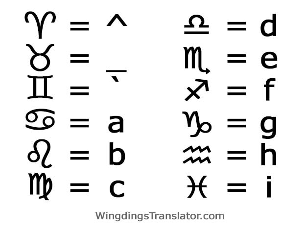
Using Wingdings, you can type the following lowercase letters (^_`abcdefghi) to get the twelve signs of the zodiac symbols in your keyboard, just like the zodiac sign emojis. ♈ Aries ♉ Taurus ♊ Gemini ♋ Cancer ♌ Leo ♍ Virgo ♎ Libra ♏ Scorpius ♐ Sagittarius ♑ Capricorn ♒ Aquarius ♓ Pisces
4. Hidden Tricks in the Font “Wingdings 2”
Using Wingdings 2 you can add extra symbols to your Wingdings Alphabet and make your secret language and texts even more cryptic!

Try typing your phone number in Wingdings 2. The numbers will have a circle around them, looking more like images than text. Type in lowercase and you will discover that the “i” reveals the number “0”. The numbers 1 through 9 can be produced by typing “j” through “r” in lowercase.
Find hand language symbols using lowercase “A” through “N”. Two other useful symbols are a cross and a check mark in a square. Typing uppercase “Q” will create a cross and when typing “R” a check mark in a square will be revealed. These two are especially useful when creating surveys or questionnaires. Increase the size of the letters to 72 to make the symbols stand out clearly.
5. Hidden Tricks in the Font “Wingdings 3”
Lower case the “w” key to create an arrow pointing forward with a white background. Type “v” to make a backward-pointing arrow appear on a white background. Press the “u” and you will create a forward arrow with a black background. Type “t” and a back arrow on a black background will appear. Most of the arrow symbols in Wingdings 3 will be thinner than these four.
What Wingdings Really Means
Wingdings was the brainchild of designer couple Charles Bigelow and Kris Holmes, also responsible for the popular Lucida font. The gestures, objects, mushrooms, and various other symbols offered by Wingdings could be used to decorate, animate, or complement documents.
This variety made the font, which was acquired by Microsoft in 1990, very popular. Bill Gate’s company acquired the rights to Lucida Icons, Lucida Arrows, and Lucida Stars and combined them into a single source called “Wingdings,” which was included in a beta version that same year. Storage space limited the number of characters the company could include – it was willing to include as many fonts as possible on the launch floppy. Despite these limitations, a cultural phenomenon began.
Microsoft came up with the name “Wingdings” as a combination of an old term used in print, “dingbat,” and “Windows.” This new name “suggested savagery and excitement,” Bigelow said, like real wingding. From the start, Wingdings was a success, much of which was due to its inclusion in the Microsoft ecosystem.
The misunderstood font
As is often the case today, Wingdings was occasionally misunderstood at the time. Although it was intended to function separately, to individually add a touch of creativity, some users interpreted it as an unusual source for writing words and sentences. This carried certain unforeseen events.


